New Spiio App Release Highlights – October 2021
Dear valued SPIIO customers:
Best,
Team Spiio
1. Installation Pictures and Notes in the Sensor Context Menu.
Make it easier to find your Spiio. Taking photos and notes during your sensor installation will help you later to pinpoint your installation spot when grass has grown over it. To save you from searching for photos from the installation, we integrated this best practise into our installation flow for the iOS App. Take pictures during the installation and you will later on be able to find the photos in our iOS App and Web App. In the WebApp you will from now on be able to upload pictures that you have taken during your SPIIO installation. Use reference points. As a best practice we recommend to triangulate the location using a tape measure from 3 different points like valve boxes, irrigation heads or couplers. One good picture is better than three bad ones.
2. Landing Page in Web App changed
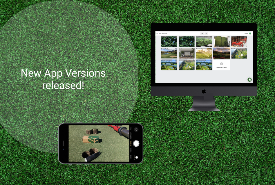
Get the overview on the first sight. To provide you with a better overview of your project landscape, we changed and updated our landing page in the Web App. Users will directly get the overview of all projects they are assigned. If you press on a project card, you can directly zoom into the detailed data of your project.
3. Usability Optimizations and General Performance Improvements
In our Web App:
- Custom Data Selection: You can now look into the very details of your historical data. Instead of showing average daily values we now show you a line chart with detailed daily values, so you can comprehend detailed events within a day from the past.
- Hovering on an installation spot in the uploaded installation picture will highlight the line graph for you. That makes it easier to connect the location spot with the readings of your SPIIO.
- Inactive Sensors will not show up as spots anymore in the installation picture and in the list of active SPIIOs, if you deselect “Show inactive sensors” in your SPIIO. You can still have the spots and the data shown by activating the function.
In our iOS App:
- You can now refresh your data by drawing the screen downwards.
- A disappearing top bar provides more space for your data.
- Several UI Optimizations will make it easier for you to navigate through our digital experiences.

